UI Hall of Shame: WebAssign
I’ve used WebAssign for a few math classes. Previously, it was a fairly positive experience. While dated, the site was fairly functional and responsive. It had a compact layout, only used JS when it had to, and was mostly server-side rendered (of course that meant that there had to be more round trips and page loads, but it wasn’t terrible). The ebook worked fine, and was mostly just HTML.
But it seems that didn’t give them as many opportunities to push their “value add” services, and they gimped the old site and made it load in what is essentially an iframe, with modern chrome around it. But, this was half-done in an inconsistent, confusing way.
I appreciate that they were trying to modernize their app, but they just didn’t have as good of a UI as the old one, and it feels slower to boot.
The Good (?)
WebAssign does have a fairly good homework system. The equation editor is one of the better ones I’ve used, and since that part is unchanged from the redesign it makes it more impressive since the editor must’ve been fairly old.
The Bad
Mysterious buttons
I access the textbook through WebAssign. Quick, tell me what you think the two buttons below do:
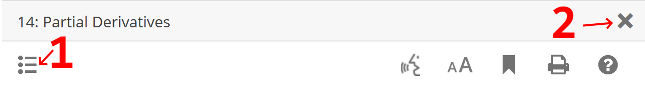
If your answer was that 1 brings you to the chapter table of contents, and 2
brings you to the table of contents for the entire book, you must work for
WebAssign, because that made no sense to me.
Worthless sidebar
They’ve also added this nice sidebar on the left hand of the screen, whose primary purpose seems to be to take up screen real-estate when I have two windows side by side, like when, I don’t know, I’m doing homework.
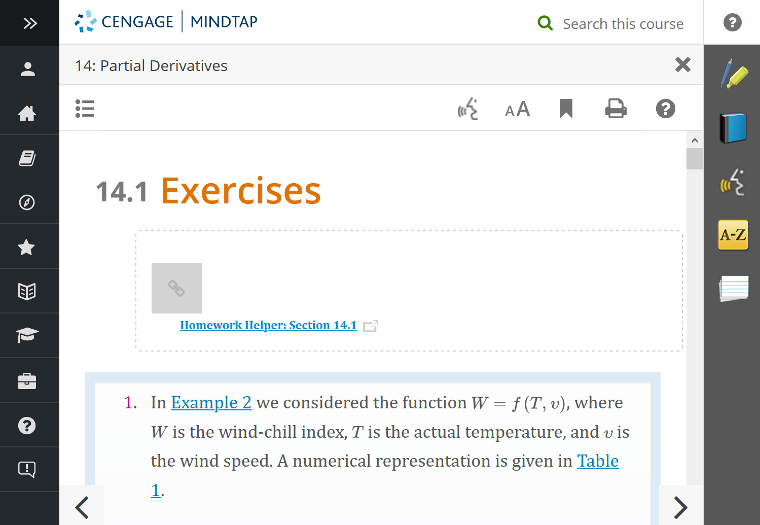
This is an example of having icons for the sake of having icons, since I have no idea what any of these do. Let’s expand it to see what they are.
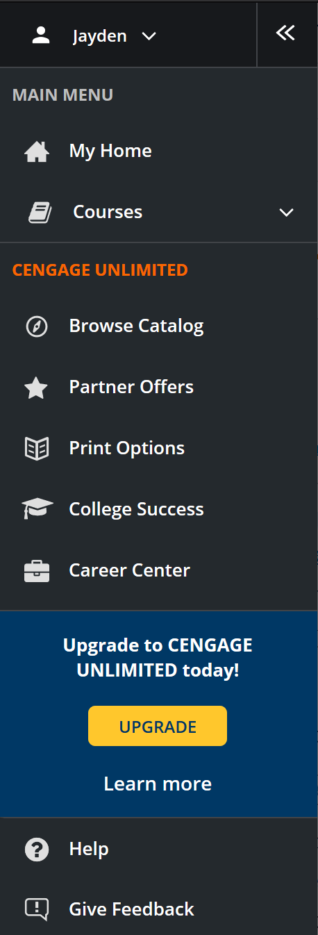
Ah, mostly trying to sell me some “value added” stuff of questionable value. Glad that sidebars there now.
That horrible side window
Let’s add a new ublock origin rule for that sidebar and move on to actually trying to read the textbook.
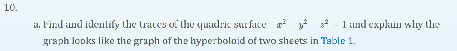
Let’s follow that link to Table 1. After all, one of the principal advantages of ebooks is the ease of following links around without having to flip pages back and forth.
Here’s a video:
👏👏 what fantastic stuff.
To recap:
- Click the link. It opens a sidebar for some reason. OK fine whatever.
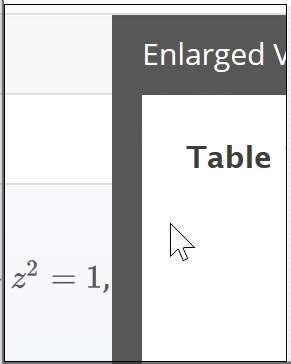
- Open to the page in the book, center on the “chart” (more on this)
- After it finishes loading scroll away from the chart
- The chart is incomplete, and not clickable except for a tiny ➕ in the corner. Classy
- Click on the plus, now it loads again
- Be greeted by this wonderful horizontal scrollbar broken table (earlier it would actually load images in the left column, but apparently I got some bonus bugs for the video)
Oh, and you can’t make that sidebar wider for some reason. Wonderful!
When I click on it it just makes this weird dotted line thing appear next to it that does nothing.