UI Hall of Shame: MyMathLab
Just wanted to gripe about the amazingly poor UI MyMathLab, (aka MathXL, a Pearson product) an online learning system, has.
So, you want to insert a matrix into the answer field.
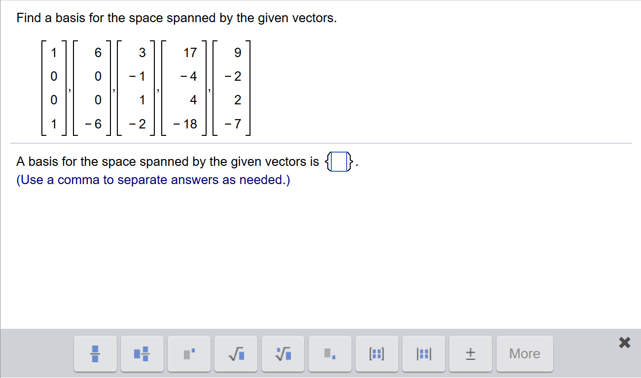
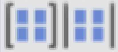
Be sure not to miss the two pixel difference from the matrix and determinant buttons down there
Now you are presented with this wonderful dialog:
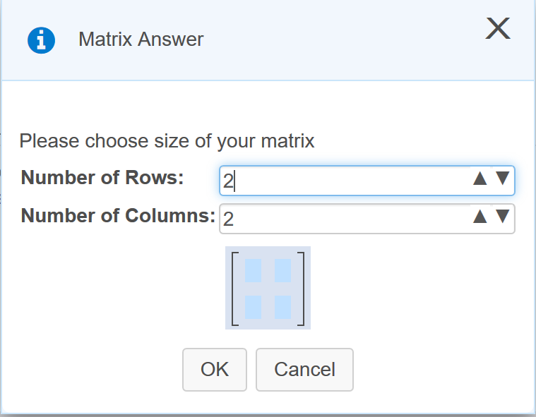
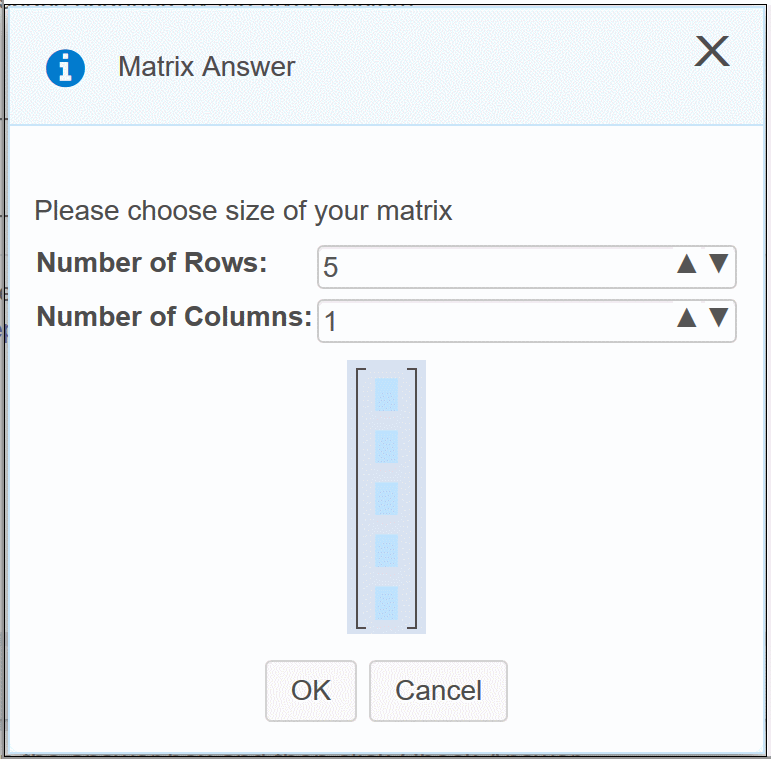
Let’s say I need a 5x1 matrix. Let’s type a 5 in that first box
Oh wait, despite that looking deceptively like a text field, and the cursor indicating that it is, you can’t actually type in there. So we give up and go to use those arrows
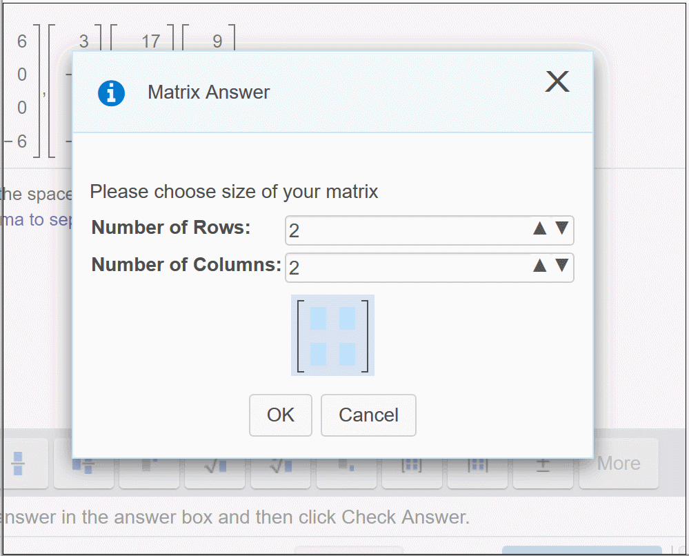
Ahh, MyMathLab follows the “move buttons away from under the user’s mouse” school of UX design. This is especially infuriating because you are forced to use those arrows and you have to do that slow little dance every time.
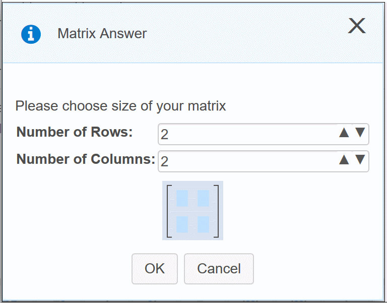
The adventerous user will discover that the arrow keys can adjust the size, but this is negated by the fact that you can’t tab between the two input fields. Break out that mouse again!
So, we finally have the right sized matrix, lets fill in some values
Just kidding, you have to click “OK” and then fill in the matrix in the normal editor.
Now do this fun little ritual several times for every problem on every assignment, and it begins to wear on you. Did I mention I paid $125 for the privilege of using this fine software?